Row Editor
To change the grid on which widgets can be placed in a row, right-click anywhere in the row and select Edit. This opens the row editor.
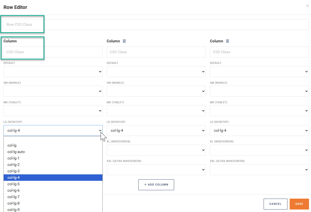
By default, a row contains one column. To place widgets next to each other, you need to add at least one column by clicking + ADD COLUMN. Each additional column can be removed by clicking the little 'trash can' icon next to the word Column.
Column Width
The width of each column is determined based on an imaginary 12 units that together define the width of the row. Each column is assigned 1 to 12 of these units, leaving the remainder available for the remaining columns.
An example may clarify this concept. Let's assume that (on a normal desktop computer screen) you want to use three columns in your row, of equal width. Each of your three columns then needs a width of 12/ 3 = 4 units. Locate the field LG DESKTOP and select the value col-lg-4 for each of the three columns.
You can use a different setup for each of the display sizes. CloudSuite's responsive design ensures that the appropriate design is used on whichever device (such as mobile phone, tablet, laptop, etc.) the visitor views your shop. If no value is set for a display size, the system will fall back on the next narrower size, all the way up to the setting for DEFAULT.
CSS Styling
The row editor also lets you specify a CCS class for the entire row (Row CSS Class) or for an individual column (CSS Class).